Google Logo Study - Design For A Colorful And Simple World
Forewords: Google logo is perhaps the simplest logo globally, but it still is the most successful logo. Follow us to explore the colorful, simple Google logo design. Watch its history. Find its logo fonts as well as its color schemes. And most importantly, design your own logo similar to Google's by clicks.
Content of Starbucks Logo Research
- Part 1: Study of Google Logo Design
- Part 2: The History, Font, Color, and Doodle for Google Logo
- Part 3: Design Your Own Logo Similar to Google Logo
Google helps us search wanted information in daily life! It's friendly, easy, and cannot-live-without! But have you ever taken a second to look at its logo? Why does the world top tech giant choose a logo like this?
Image Depict: Why does Google choose its logo like this?
Part 1 - Study of Google Logo Design
The very first impression for Google logo is simple and colorful! - That's what Google is all about.
Simple Google Logo Fits What Google Provides: If we ignore all colors in Google logo, we will only find letters in the design. That's a very simple design. And, simple is Google's theme! In real life and with rapid information explosion, we urgently need a handy service to sort information and provide what we need most. That's what Google does!
Colorful Is What Google Pursuits: Google collects all kinds of data online, sorts and presents them to its users in Google results. Regardless of race, color and area, users are treated equally. Let all kinds of colorful posts accessible by people in all colors.
The Google G Logo Debate - Our Möbius Strip Design Speculation: Google new G logo has triggered a heated debate worldwide. Many designers think it's an incomplete circle.
Wait a moment for a second thought! Seriously? As the most powerful computing company, will Google make such a brainless mistake? We don't think so.
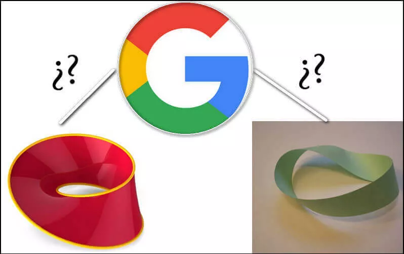
Image Depict: Möbius Strip VS Google G Logo Design
Based on the G parts drew on the G graphics, we speculate those G part shapes are perhaps parts for an unfinished Möbius strip. Only Möbius strip design has magic capability to connect two opposite sides on one strip, and it fits Google spirits to connect all people. The incomplete logo shape may infer there still remains a lot of developing works to be done.
In theory, Google logo fits Google company perfectly, so it's an effective logo.
Part 2 - The History, Font, Color, and Doodle for Google Logo
In this part, we will analyze all Google logo designs - both new G logo and old Google logos. And, you'll see Google logo history, color scheme, font, as well as figure out what Doodle is.
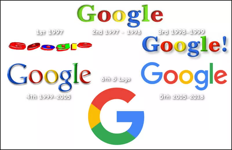
Image Depict: Google Logo History.
Google History
We find the official videotape made for Google logo history. The videotape records the logos since 1997 (not include original BackRub logo in 1996). The logo design evolution is more like a process to turn 3D logo texts to 2D logo texts, and simultaneously eliminate font effects. At last, we reach a simple, segmentation G logo.
What Font Is Google Logo?
Google doesn't use any art fonts that are hard to read. Instead, all Google logo fonts are straightforward. Audiences can immediately read the letters when seeing Google logo.
- The very first Google font in 1997 seems like a slanted Google letter in Arial Black.
- The second Google font of 1997 - 1998 names ITC New Baskerville Bold.
- The third Google logo for 1998-1999 applied the same font - ITC New Baskerville Bold.
- The fourth Google logo of 1999-2005 adopts Catull font.
- The 2005-2018 Google logo font seems like the font of Free Zone Medium.
- Current G logo font is Google's new design font, and we fail to find a similar one.
- The color scheme for 1997 first Google logo is: #C00005, #680000, #030CDF, #24F51F, #E9FB00, #D00002.
- The color scheme for 1997 second Google logo is: #2E6AF1, #FD1D0F, #FDF71A, #3772F4, #4BD00B, #FE240C.
- The color scheme for 1998-1999 Google logo is: #7BDF29, #DA2827, #FFEB36, #3070EE, #80EB28, #E42628.
- The color scheme for 1998-2014 Google logo is: #1D67EE, #F31700, #F2E900, #2260E4, #38C300, #F11C00 (and #1C65EC for exclamation mark).
- 2015 Google logo has the colors: #377DEE, #E53D26, #F0B900, #377DEE, #1FA344, #E03B23.
- 2019 new G logo consists of four colors: #E43E26, #F3B800, #26A246, #377EEC.
What Colors Does Google Logo Use?
Google logo uses single color for each letter.
What Is Google Doodle? Why Is Google Logo Gray?
Google replaces its logo frequently, and we often see cute or touching storytelling animation replaced as Google logo. That's Google Doodle. For historical dates or lives of famous people, Google replaces the homepage logo to Google Doodle.
When Google Doodle is gray, it means this day is a tragic day for all human races in history. So on Sep 11th, you'll find Google logo gray.
Part 3 - Design Your Own Logo Similar to Google Logo
Google logo represents all the positive, energetic, and young forces. It's simple, brief, and powerful. What an effective logo it is!
For those who want a logo functions the same, we present you some easy and free portals below. Just find your most favored Google logo idea, and customize it to your own logo within clicks.
Find any logo design good? Press it and make it your "Google" logo! It's FREE and QUICK!

